
based in Budapest
Vario
Brand repositioning and visual identity refresh for Vario fence system
branding
exhibition signage
editorial
web design
collateral materials
2018
Independent client work
Brand repositioning and visual identity refresh for Vario fence system
branding
exhibition signage
editorial
web design
collateral materials
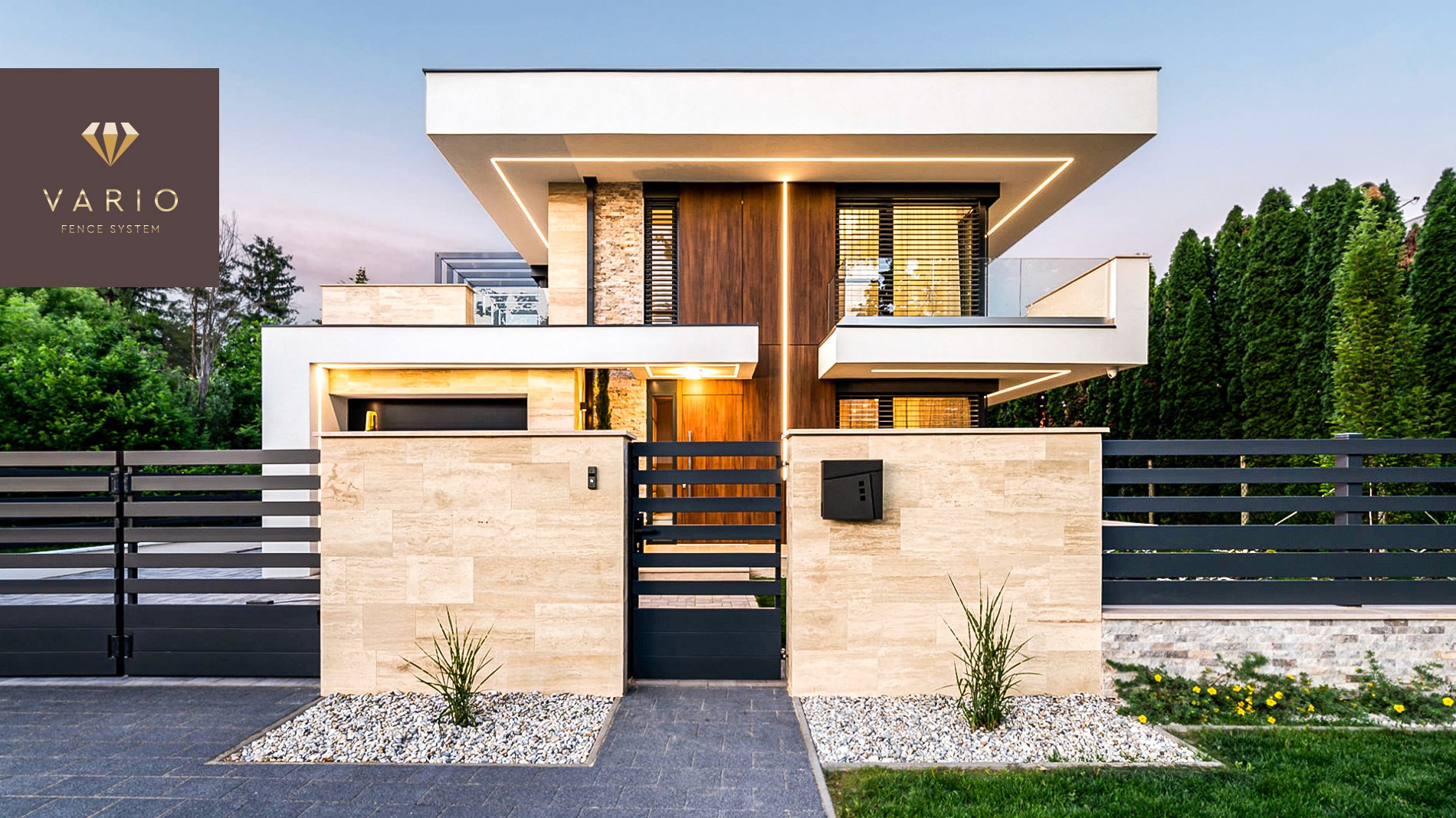
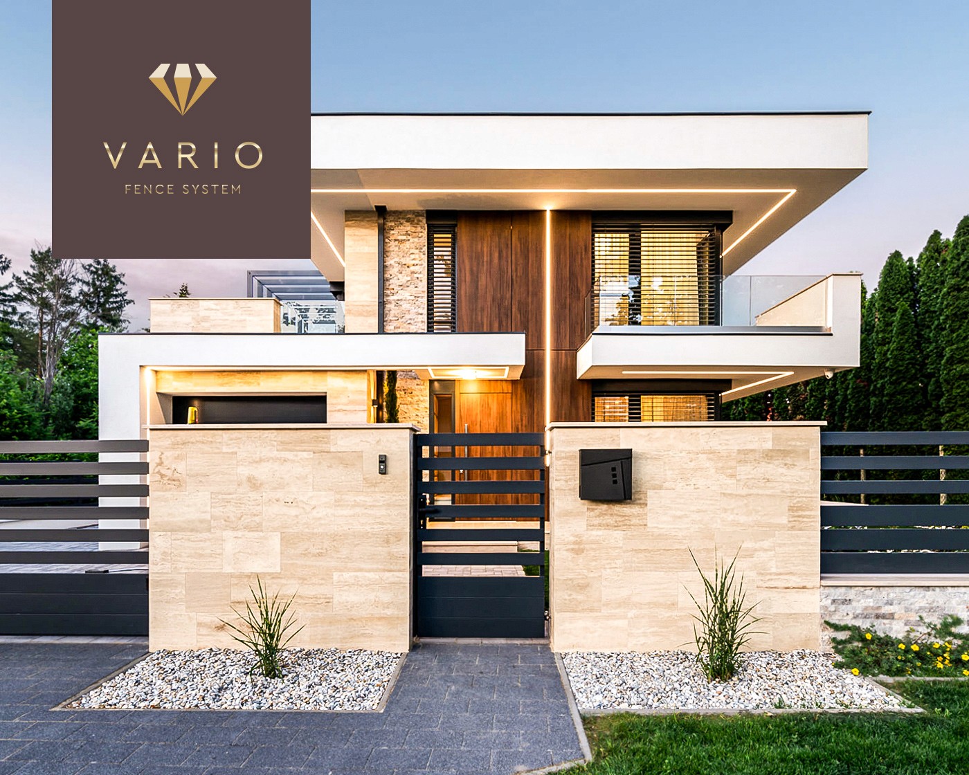
Vario designs and installs weather-resistant, long-life fences across Central and Western European markets. Built from steel and aluminium, the products carry a clean, contemporary aesthetic while offering a high degree of customization – from wood-effect textures to a wide range of colours – allowing each fencing solution to adapt to its environment and individual requirements.
The goal of the project was to rethink and modernize the existing identity, repositioning the brand through a more contemporary and internationally competitive visual system – better reflecting the quality of the products, the company’s expertise, and its premium positioning.
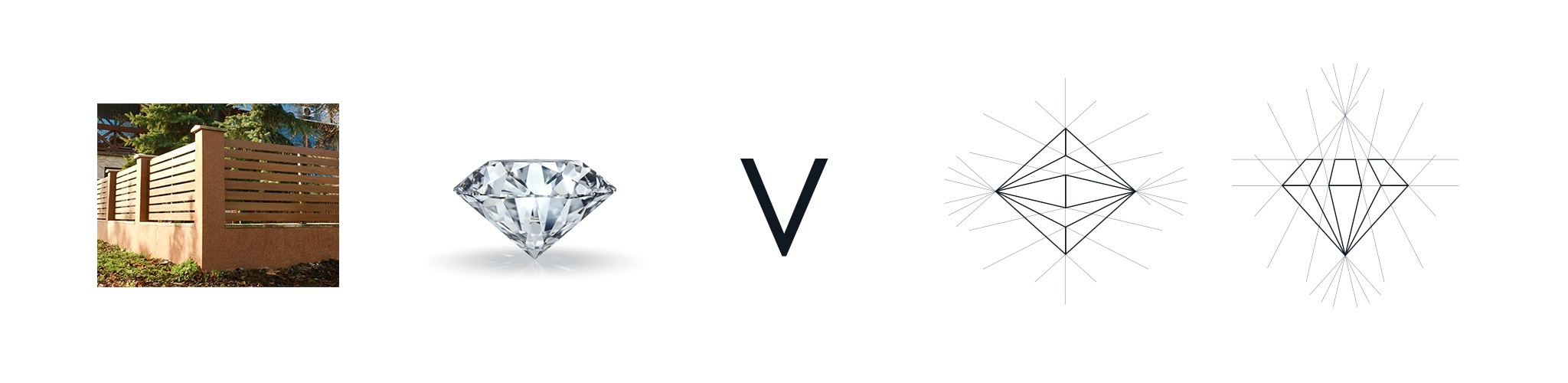
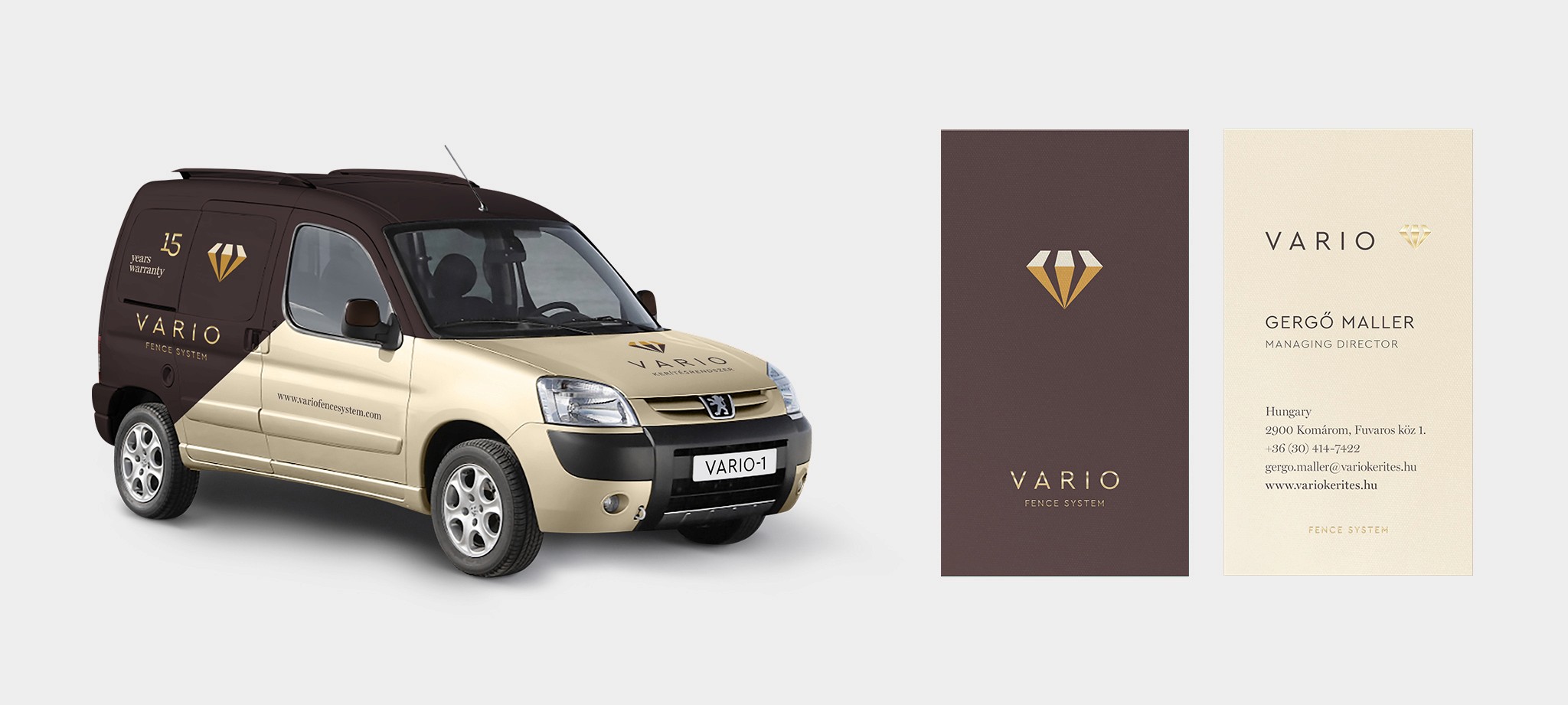
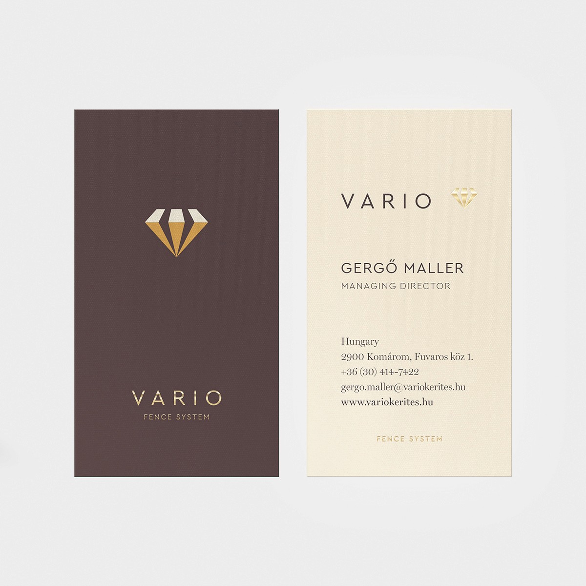
The previous logo was based on the letter “V” in the brand name, formed by the meeting points of fence elements. In developing the new identity, I carried this idea forward: the structural lines of the fence slats were emphasized through stronger perspective, and then rotated into a diamond-shaped form – becoming a symbol of strength, durability, and long-lasting quality.
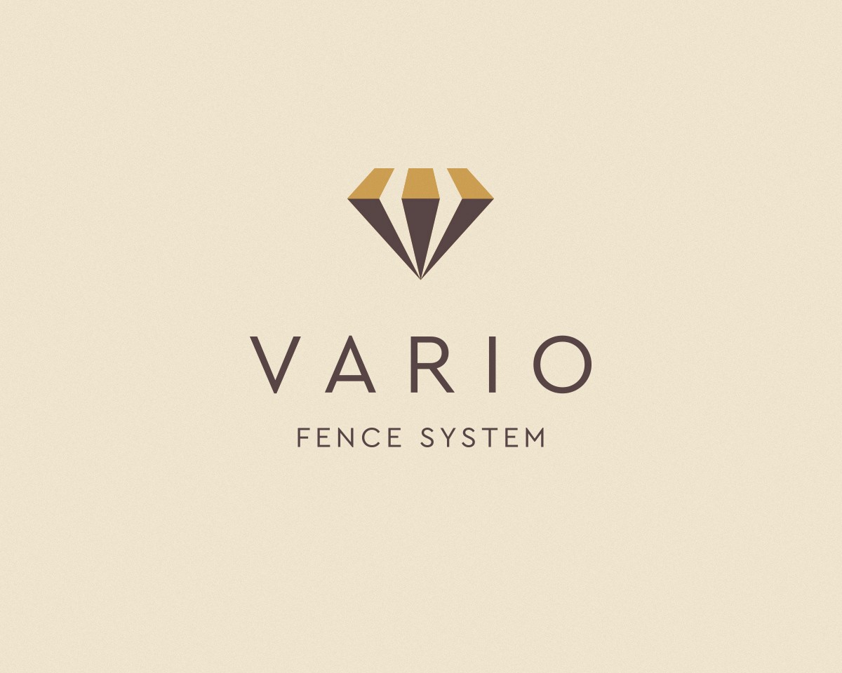
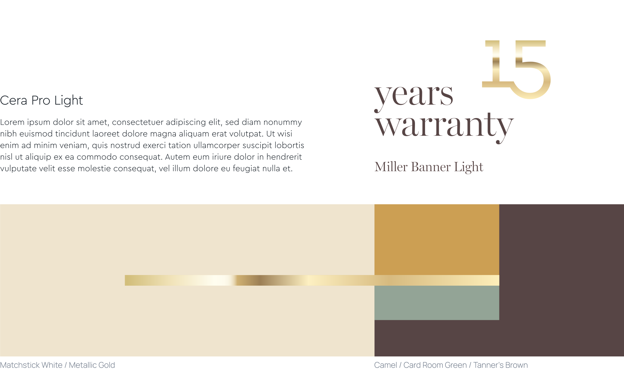
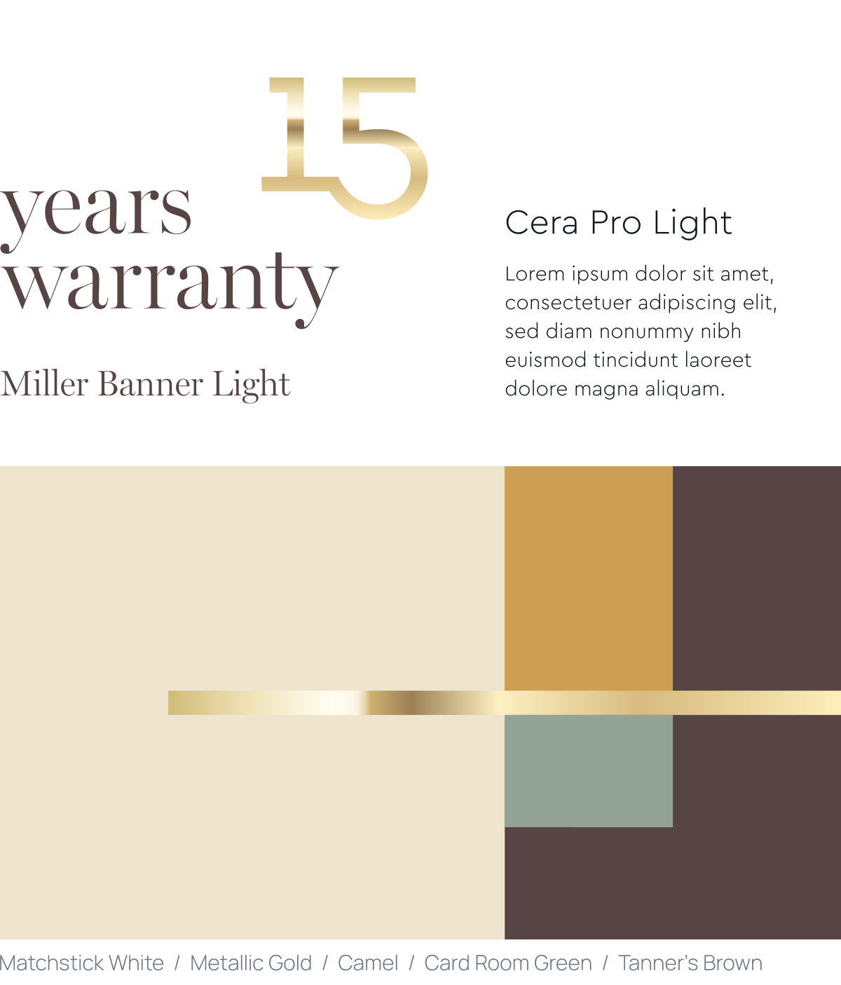
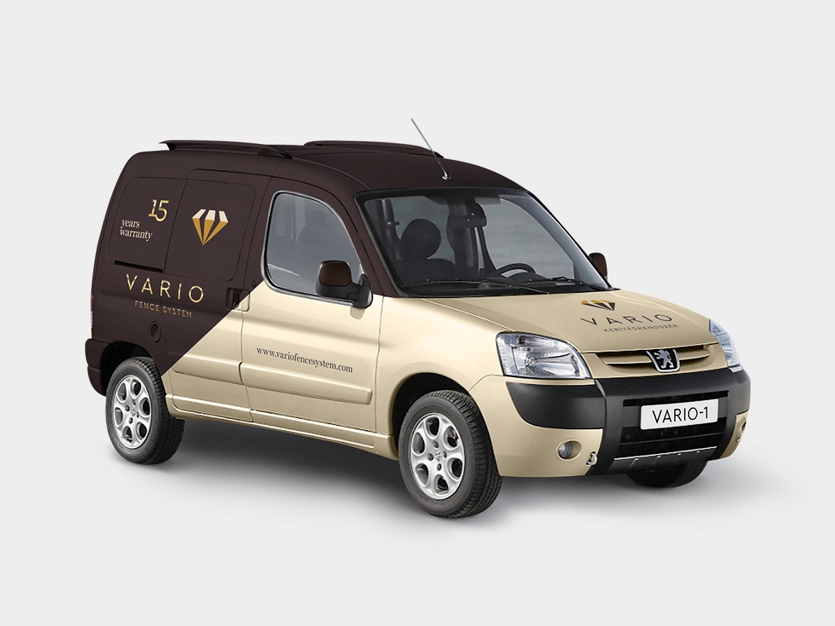
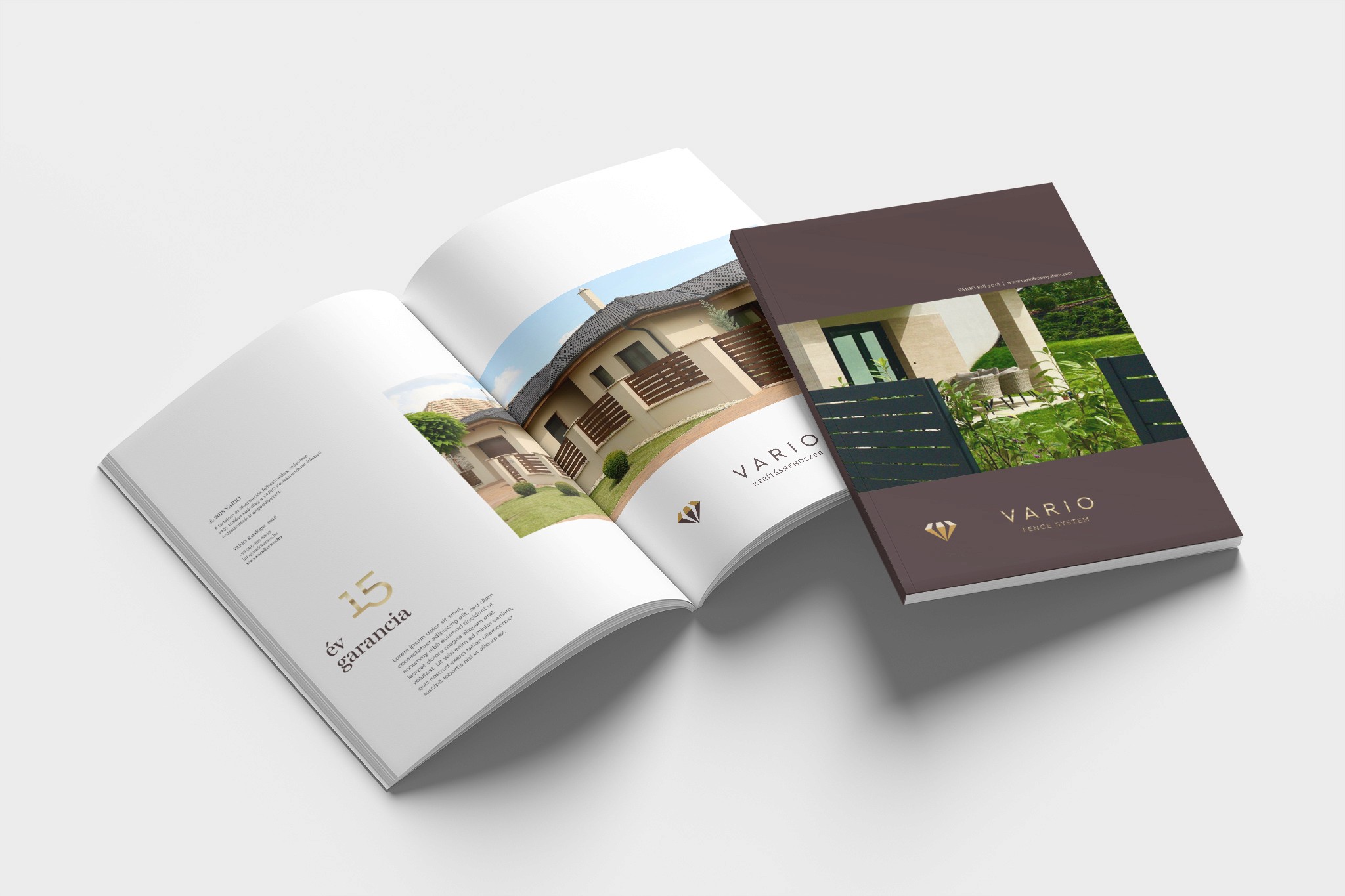
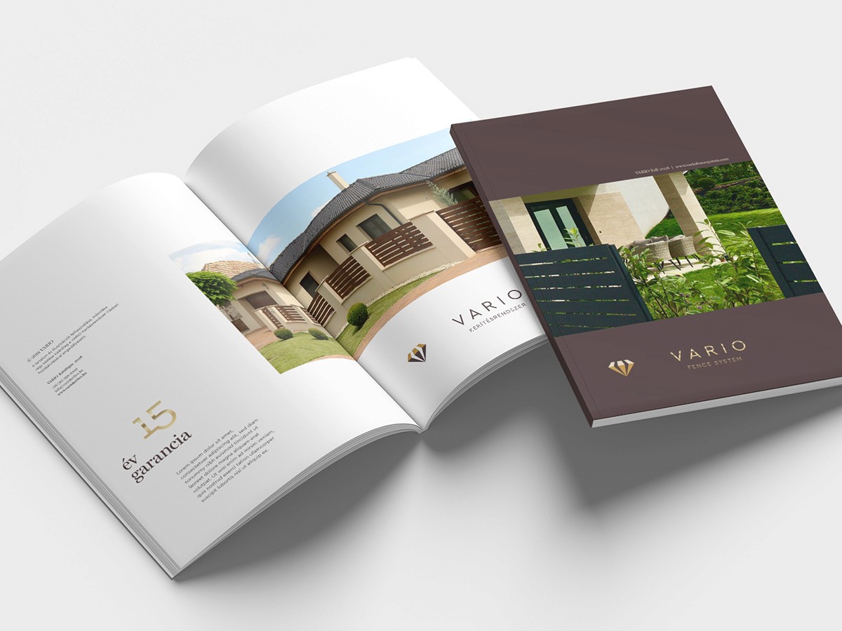
The premium character of the brand is further expressed through typography and a refined colour palette. Warm earth tones paired with metallic gold create a sense of understated elegance, stability, and professionalism, while also connecting back to the architectural context and the high quality of the products.
Vario designs and installs weather-resistant, long-life fences across Central and Western European markets. Built from steel and aluminium, the products carry a clean, contemporary aesthetic while offering a high degree of customization – from wood-effect textures to a wide range of colours – allowing each fencing solution to adapt to its environment and individual requirements.
The goal of the project was to rethink and modernize the existing identity, repositioning the brand through a more contemporary and internationally competitive visual system – better reflecting the quality of the products, the company’s expertise, and its premium positioning.
The previous logo was based on the letter “V” in the brand name, formed by the meeting points of fence elements. In developing the new identity, I carried this idea forward: the structural lines of the fence slats were emphasized through stronger perspective, and then rotated into a diamond-shaped form – becoming a symbol of strength, durability, and long-lasting quality.
The premium character of the brand is further expressed through typography and a refined colour palette. Warm earth tones paired with metallic gold create a sense of understated elegance, stability, and professionalism, while also connecting back to the architectural context and the high quality of the products.
Get in touch