
based in Budapest
GAL
Brand identity and packaging system contributions for GAL vitamins and supplements
branding assets
ads
packaging
collateral materials
brandbook
2015
Agency work ∙ Unger & Partners
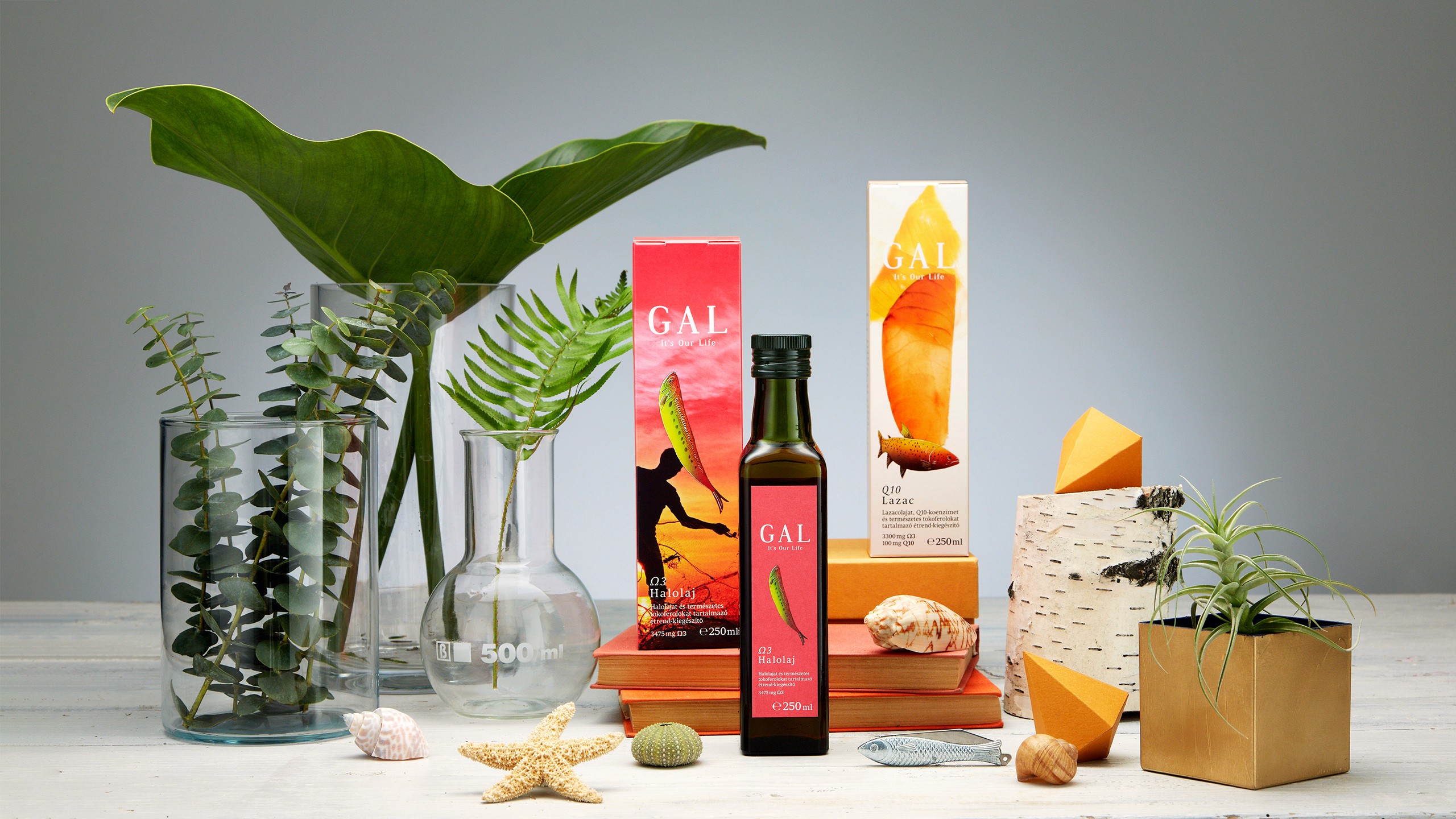
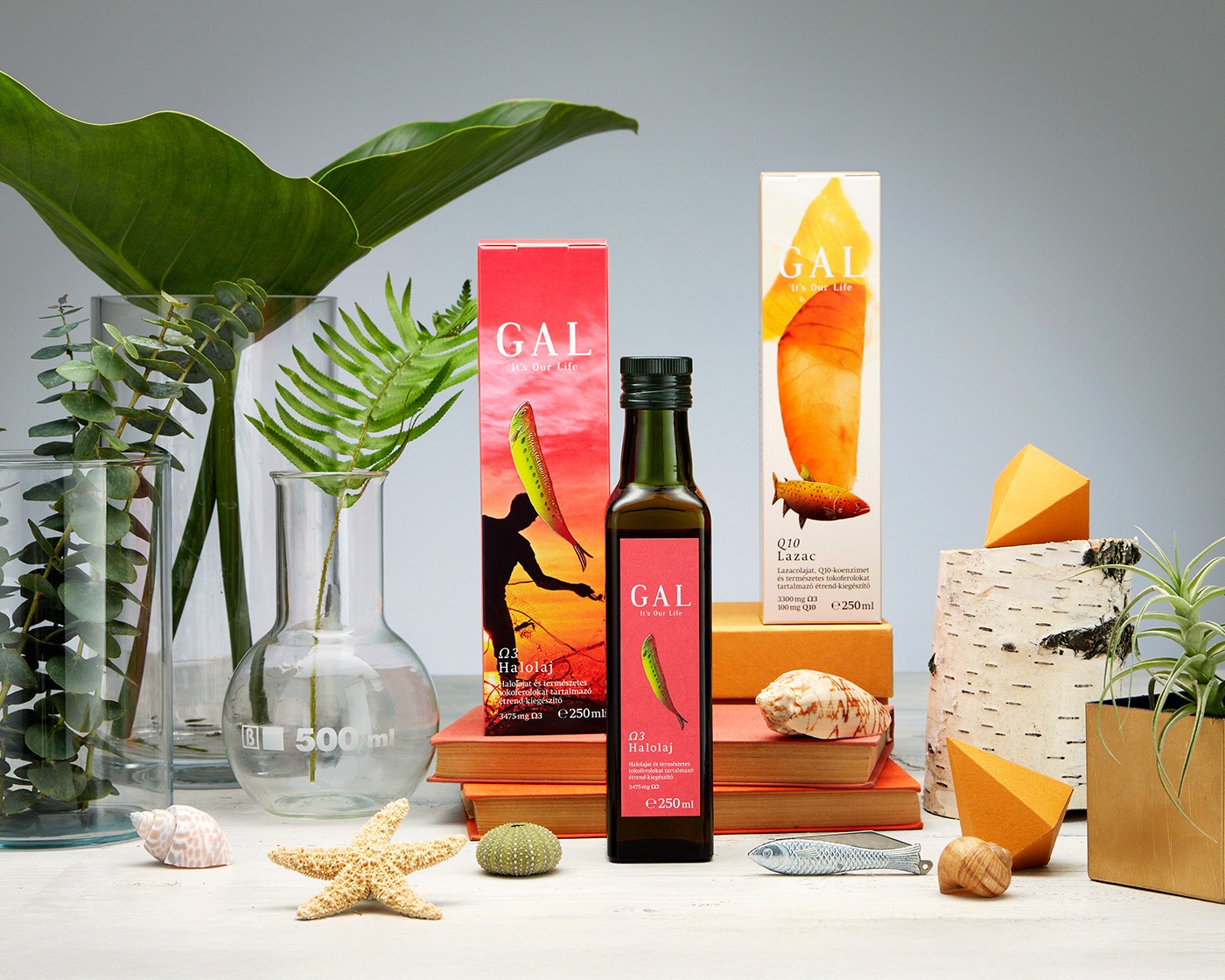
Brand identity and packaging system contributions for GAL vitamins and supplements
branding assets
ads
packaging
collateral materials
brandbook
The visual identity was developed with a focus on reflecting the brand’s core values: GAL products represent the highest level of quality, with ingredients present in forms and ratios that mirror those found in natural foods.
The brand concept is built around three pillars – quality, closeness to nature, and joy of life – offering a consciously different, refreshing approach within the vitamin and dietary supplement category.
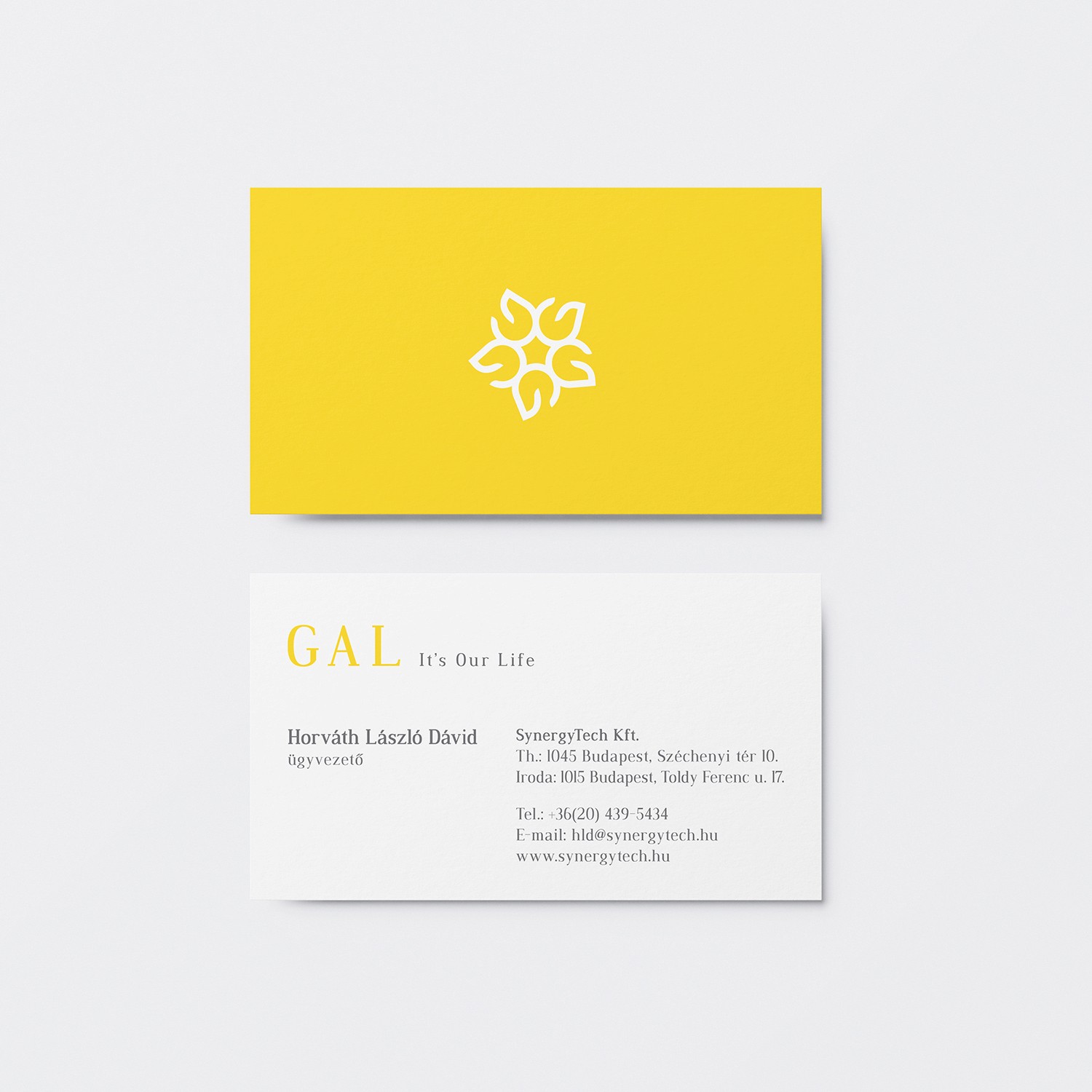
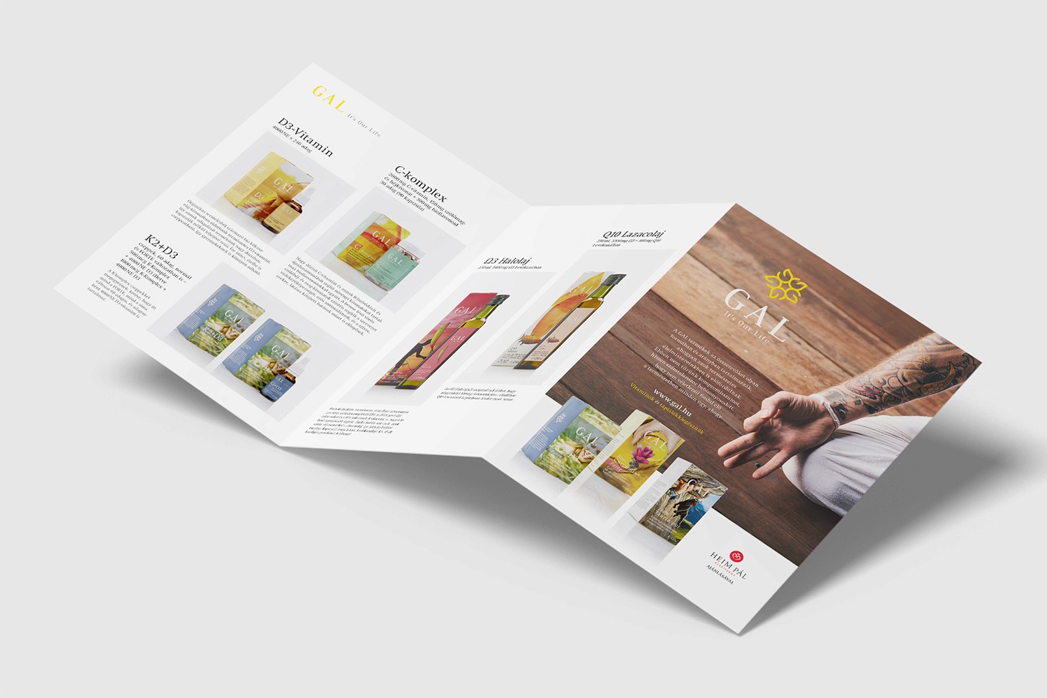
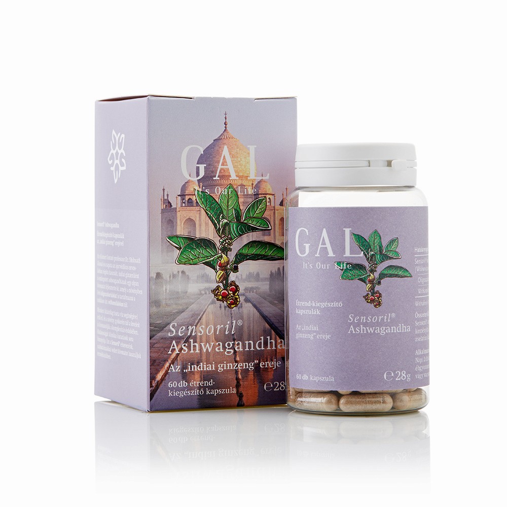
The organic floral motif of the logo was designed by me as a complementary element to the brand foundation, reinforcing its close-to-nature visual tone. Based on the brand identity and packaging concept, I shaped the appearance of more than 15 products, in close collaboration with the team and the illustrator.
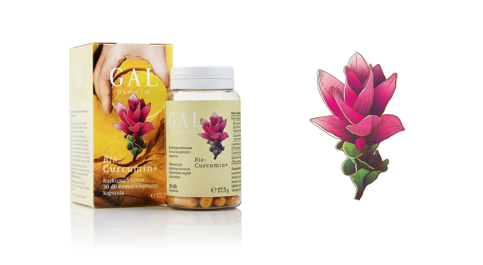
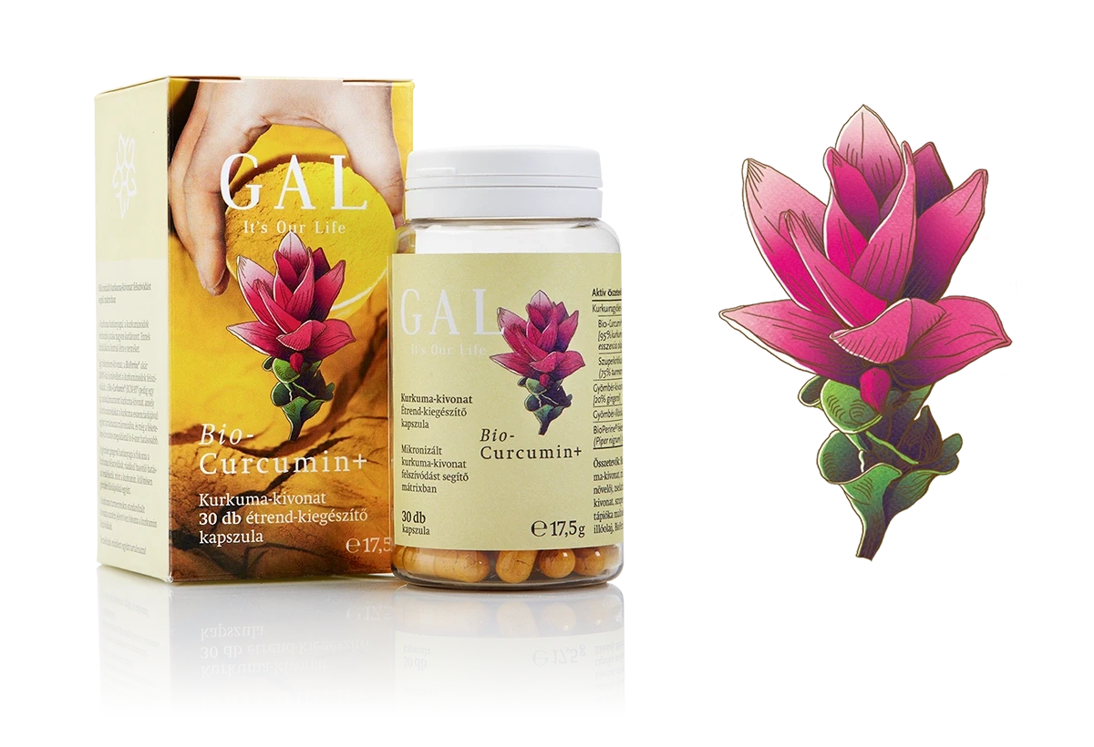
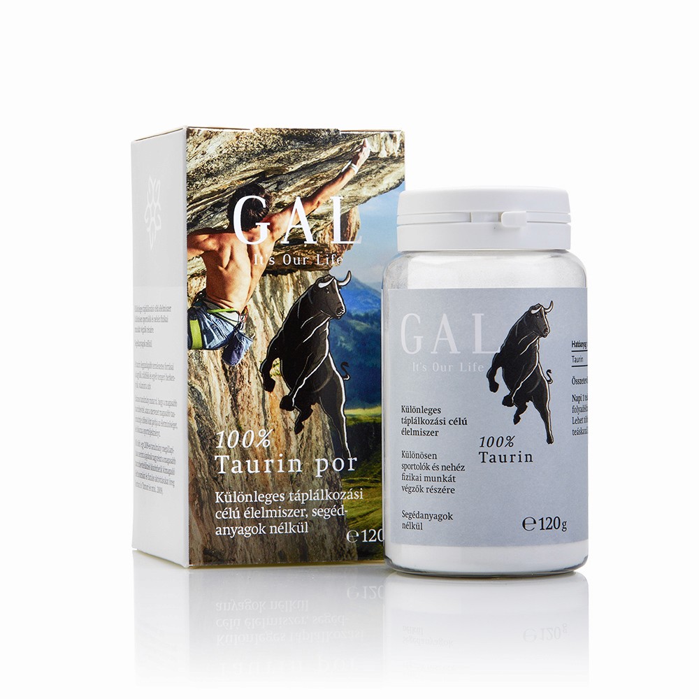
Hand-crafted, decorative, painterly illustrations were created for dietary supplements, preserving botanical and zoological recognisability while forming a distinctive and expressive visual world.
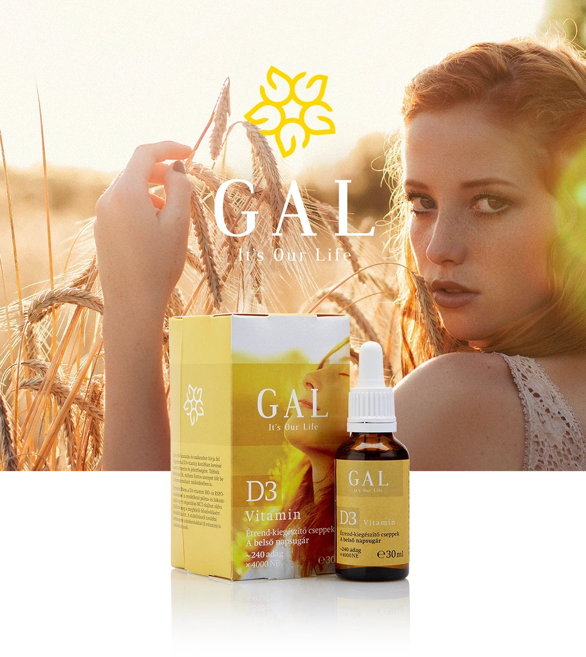
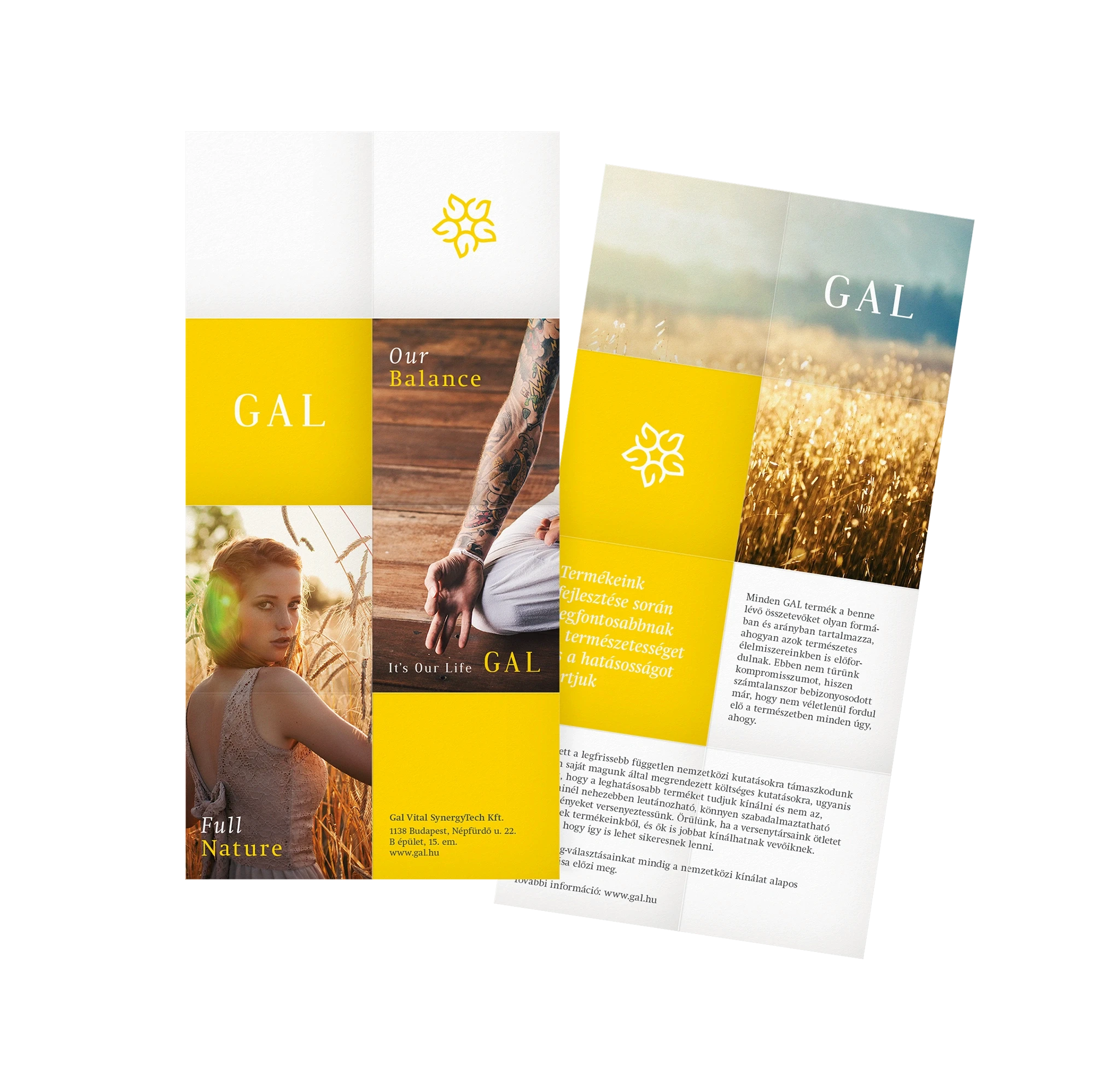
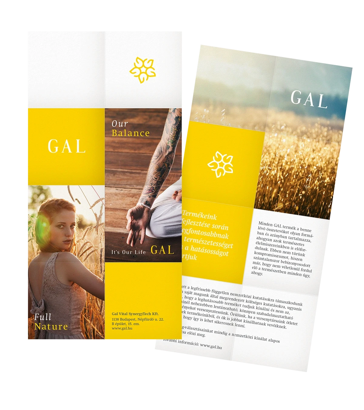
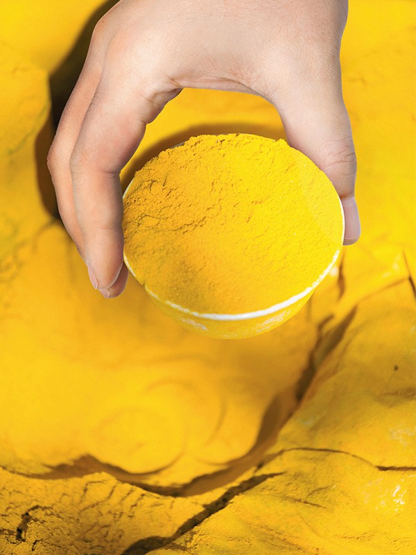
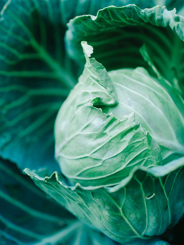
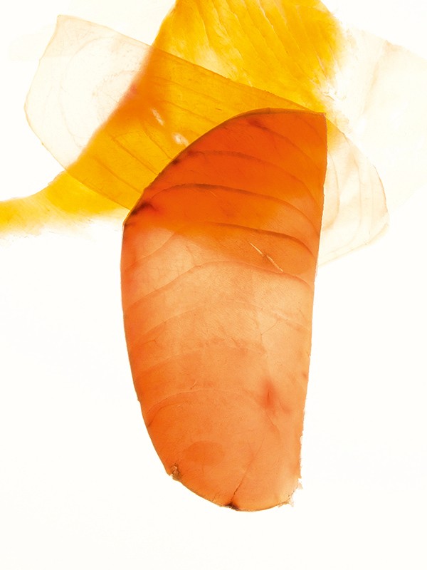
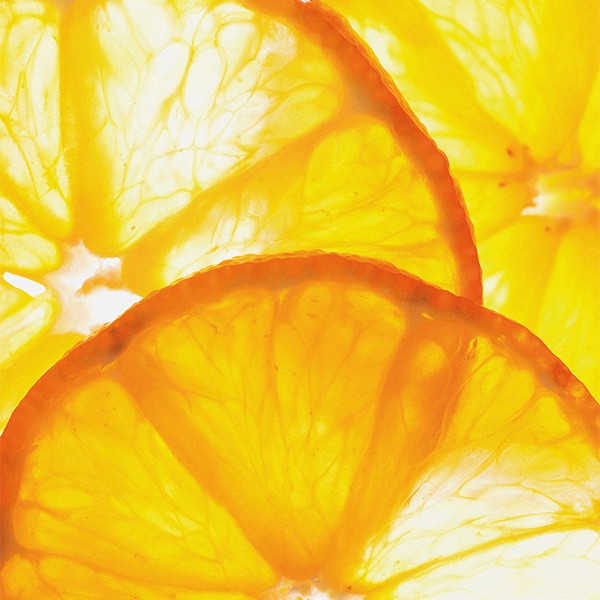
Organic, lively photography also plays a key role in the brand’s visual language, strongly defining each product’s character together with its base colour. The imagery is always connected to the specific product through its ingredient origin, mechanism of action, or field of use.
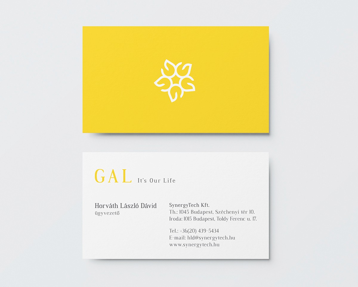
Alongside packaging, brand assets, and advertising materials, the development of the brand guideline was also part of my responsibilities.
The visual identity was developed with a focus on reflecting the brand’s core values: GAL products represent the highest level of quality, with ingredients present in forms and ratios that mirror those found in natural foods.
The brand concept is built around three pillars – quality, closeness to nature, and joy of life – offering a consciously different, refreshing approach within the vitamin and dietary supplement category.
The organic floral motif of the logo was designed by me as a complementary element to the brand foundation, reinforcing its close-to-nature visual tone. Based on the brand identity and packaging concept, I shaped the appearance of more than 15 products, in close collaboration with the team and the illustrator.
Hand-crafted, decorative, painterly illustrations were created for dietary supplements, preserving botanical and zoological recognisability while forming a distinctive and expressive visual world.
Organic, lively photography also plays a key role in the brand’s visual language, strongly defining each product’s character together with its base colour. The imagery is always connected to the specific product through its ingredient origin, mechanism of action, or field of use.
Alongside packaging, brand assets, and advertising materials, the development of the brand guideline was also part of my responsibilities.

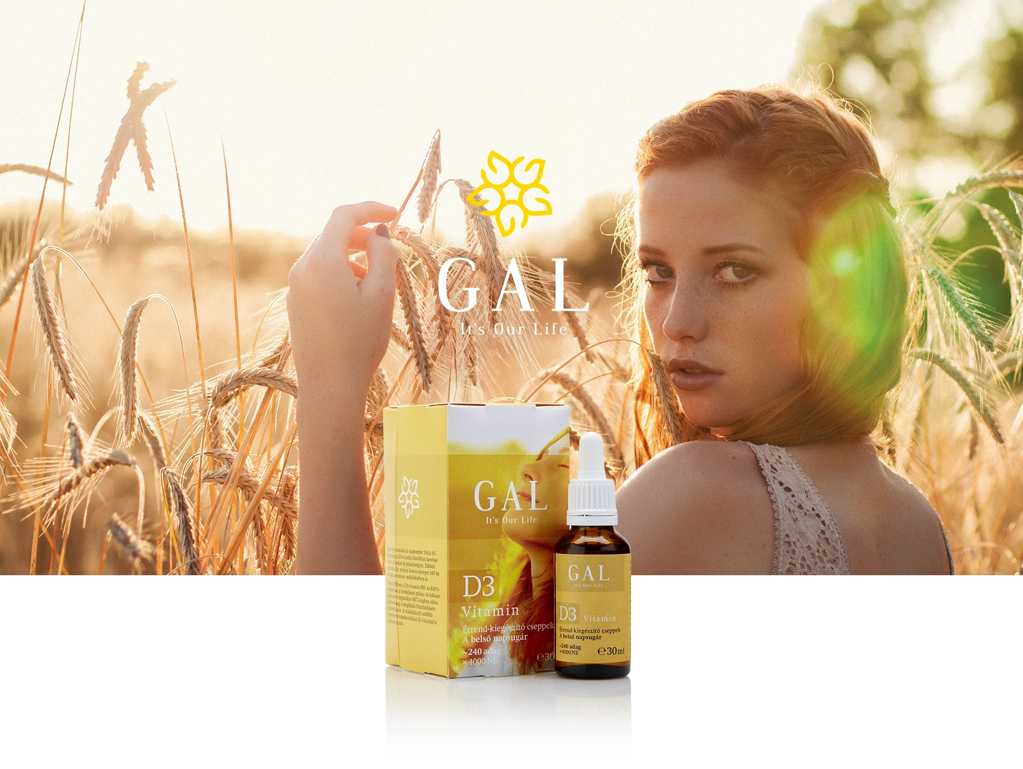
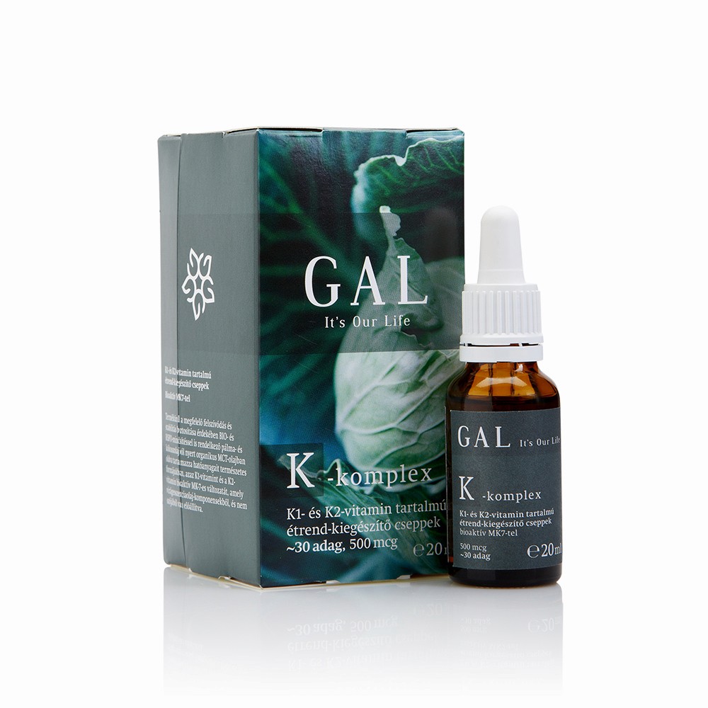
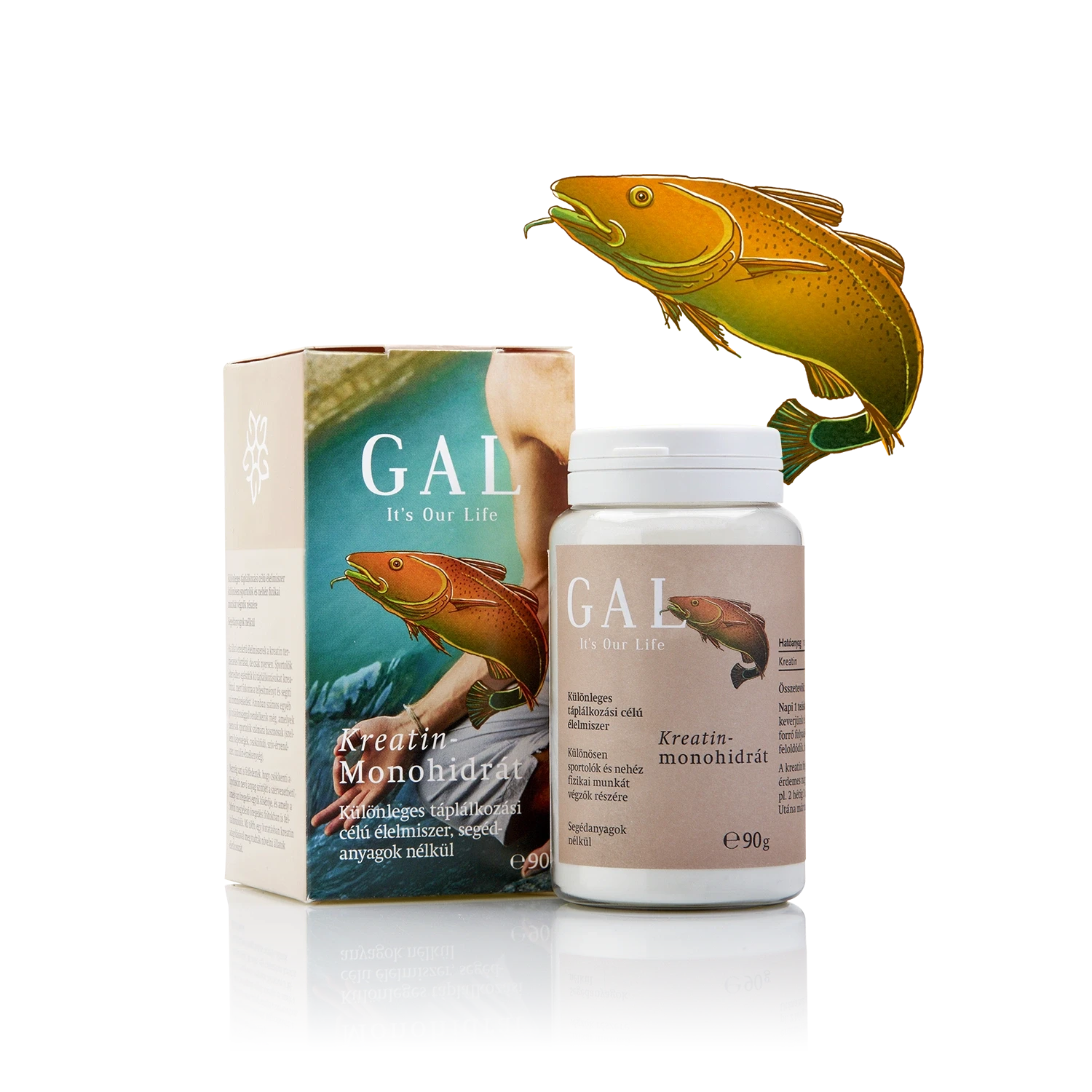
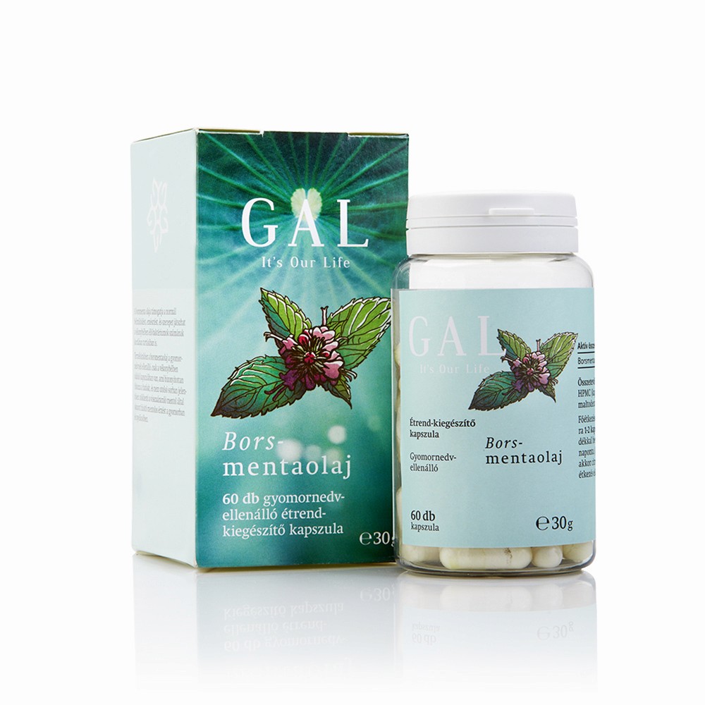
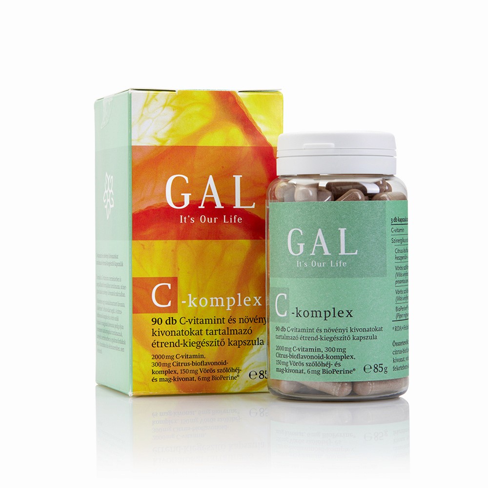
Packaging imagery and mood ∙ Stocksy








Concept
Unger & Partners
Photography
Miklós Surányi
Illustration
Hajnalka Cserháti
Get in touch