based in Budapest
Portamira
Comprehensive brand identity for a premium handmade jewelry brand
branding
jewelry design
social content
photography ∙ styling
digital campaigns
packaging
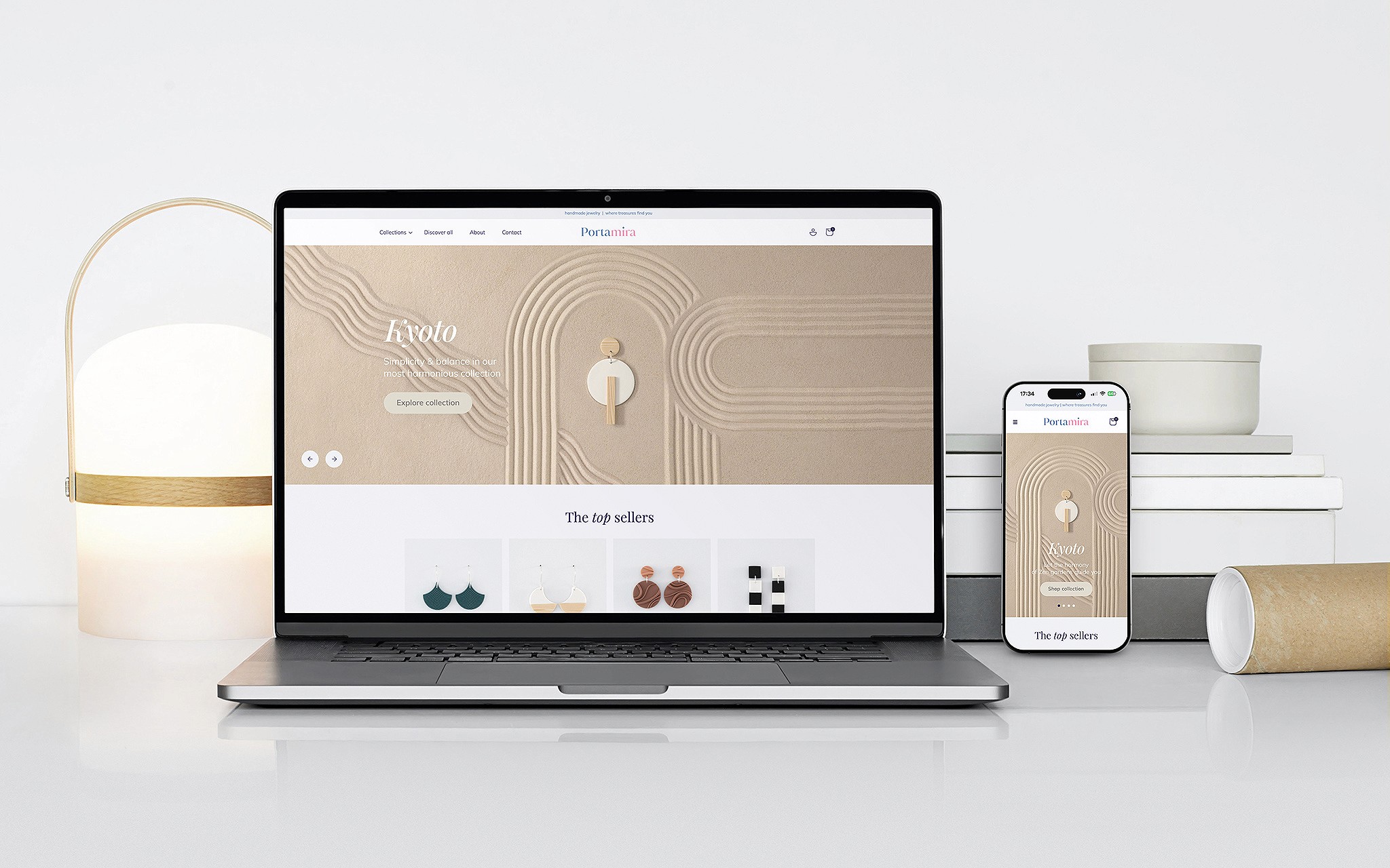
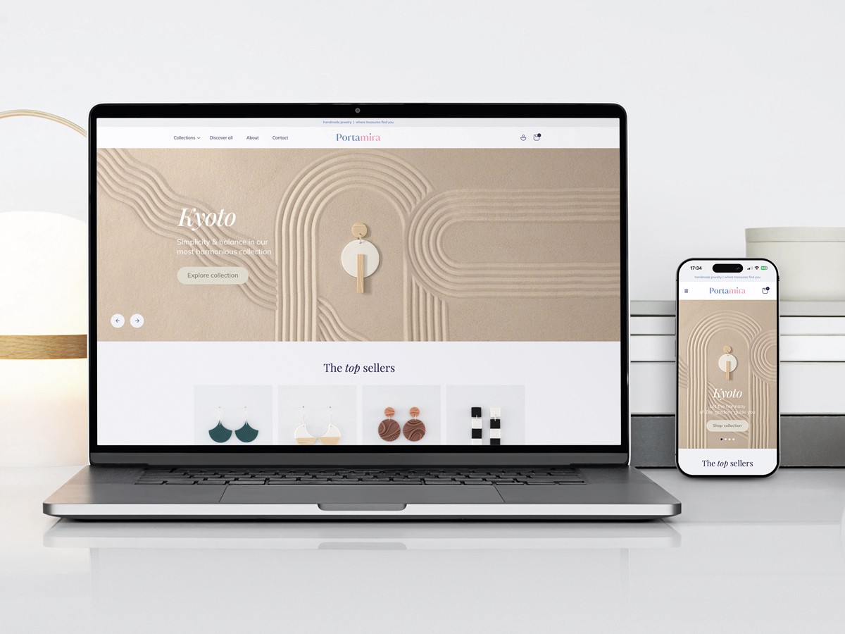
Shopify webshop ∙ custom UI
2025
Personal project
Comprehensive brand identity for a premium handmade jewelry brand
branding
jewelry design
social content
photography ∙ styling
digital campaigns
packaging
Shopify webshop ∙ custom UI
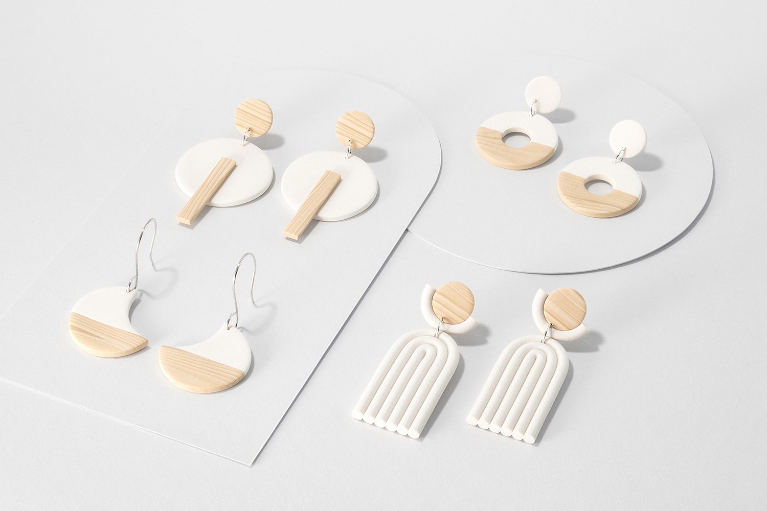
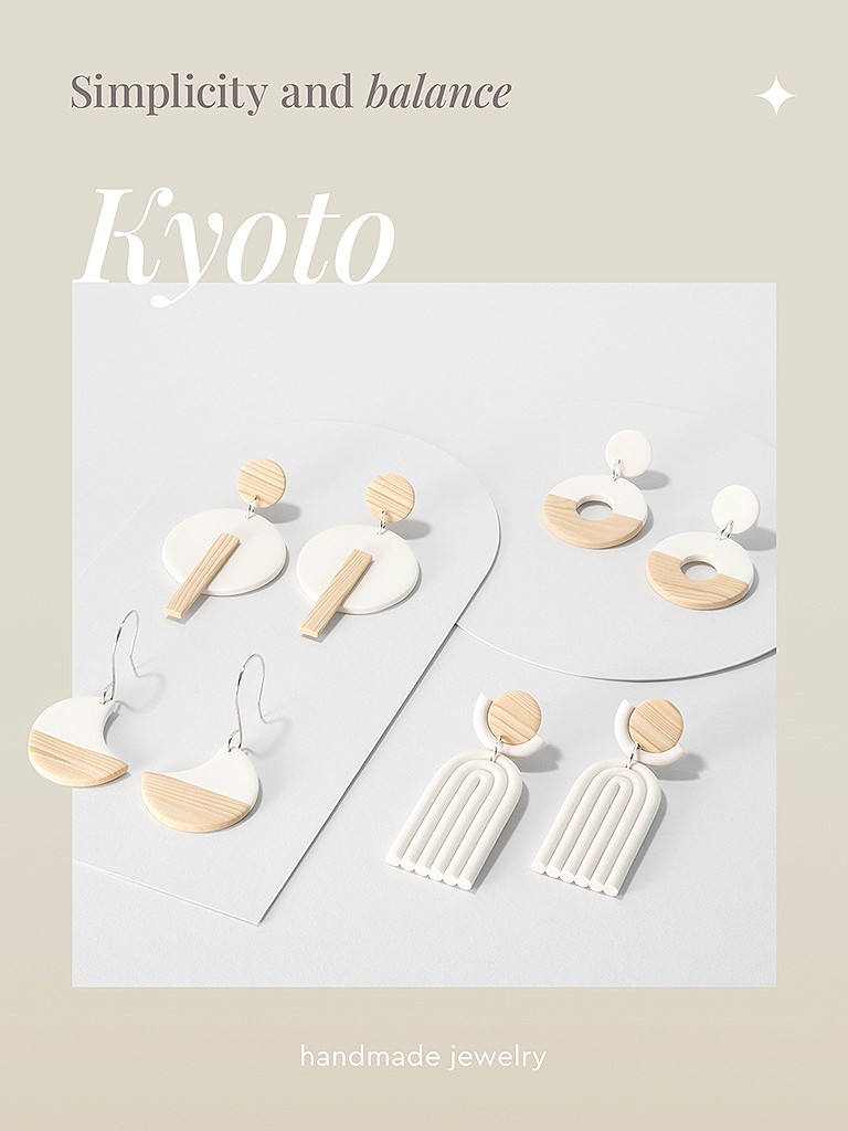
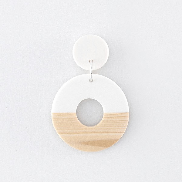
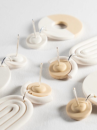
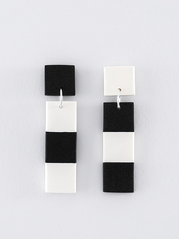
Portamira is a small jewelry studio offering handcrafted, unique pieces sold exclusively online and available internationally. The goal was to create a distinctive visual identity that moves beyond the typical handmade aesthetic, elevating the perception of quality and precision to a more refined, professional level.
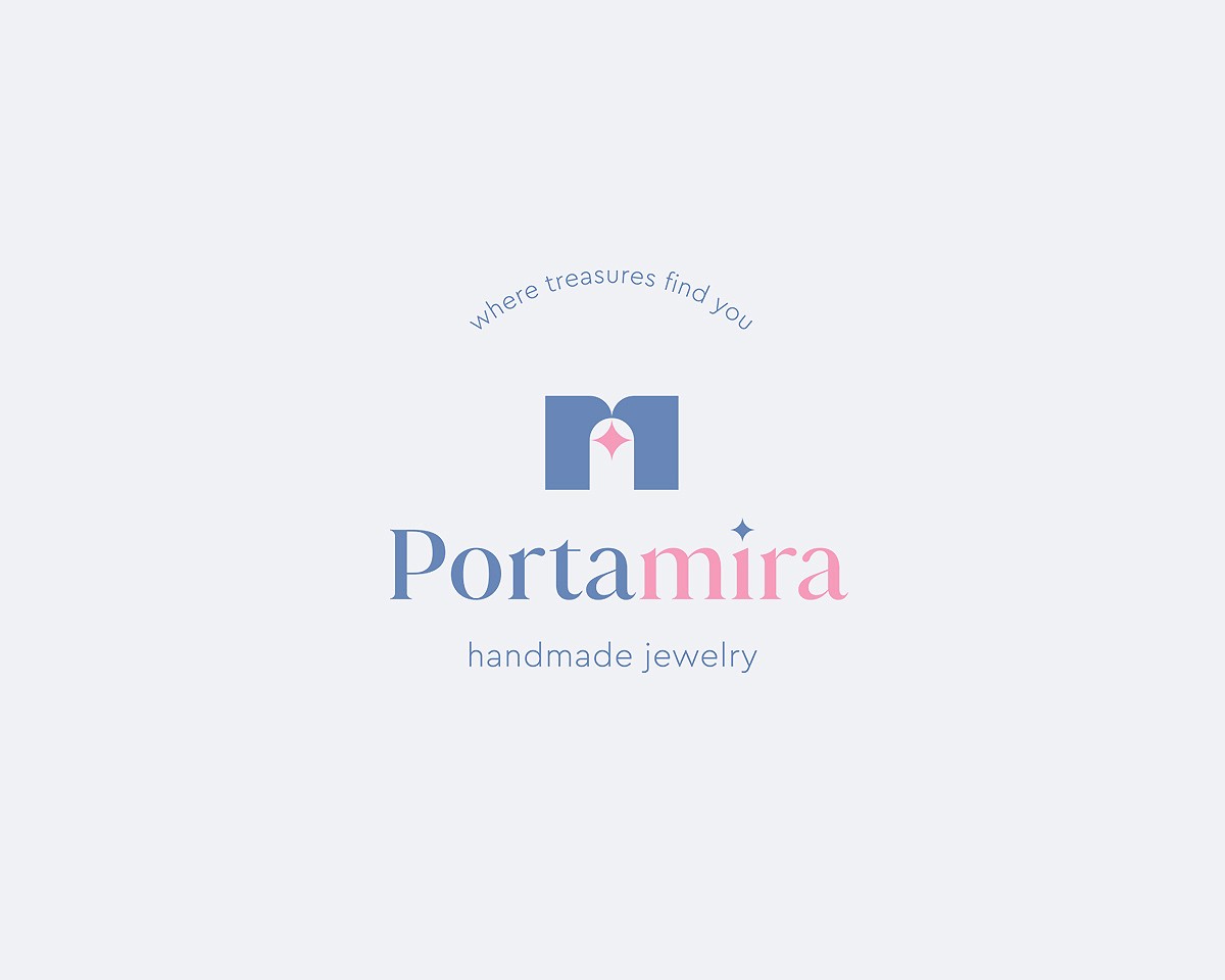
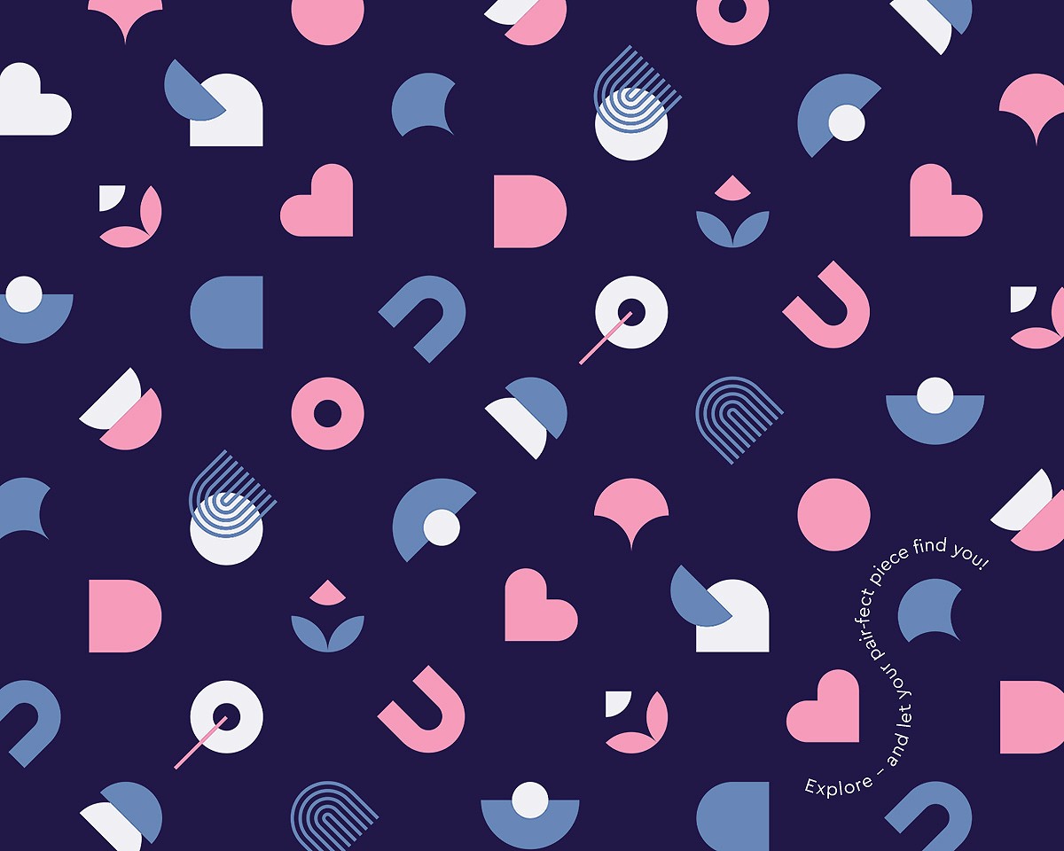
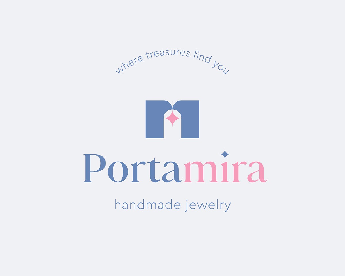
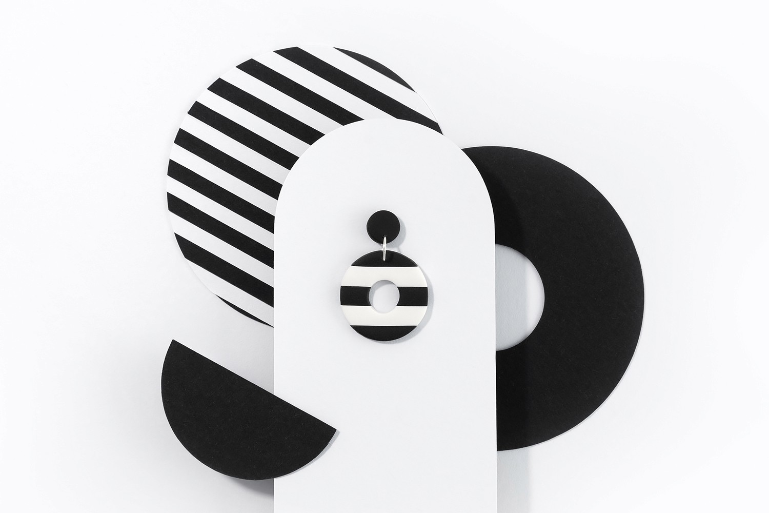
The concept is built around an elegant yet subtly playful brand world that invites exploration. Within this realm, each piece becomes a personal treasure, encouraging the wearer to express their unique personality. This idea is reflected in the geometric visual language, with the arch motif as a recurring element that frames and highlights the jewelry across applications.
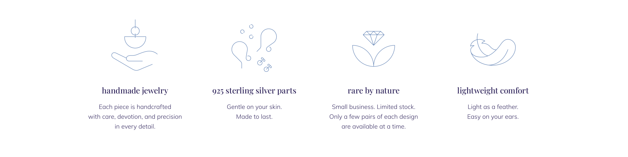
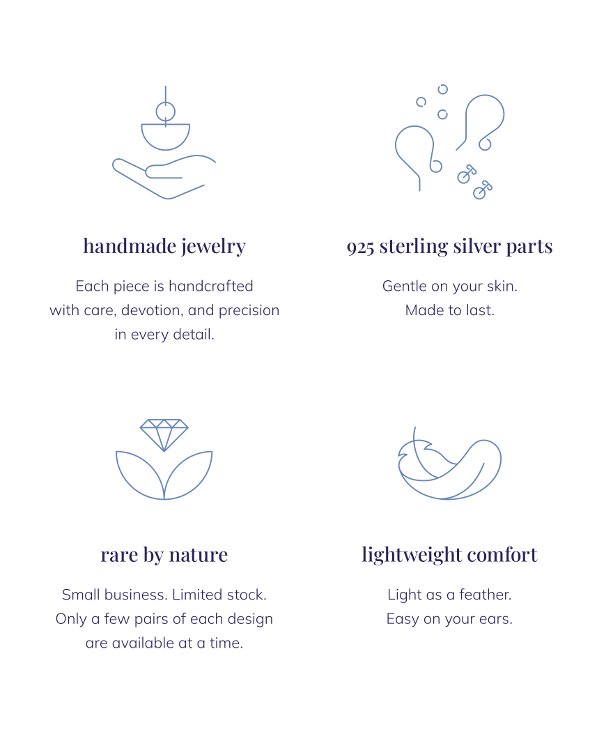
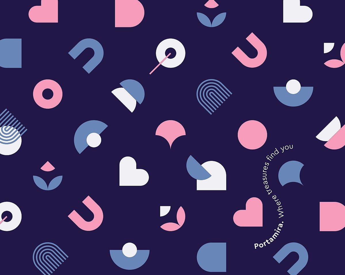
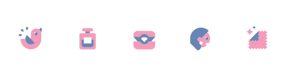
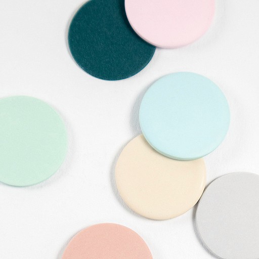
The clean, structured foundation is softened by more lively colors, patterns, and icons, allowing the brand to feel both premium and approachable. The result is a cohesive, recognizable, and scalable visual system.
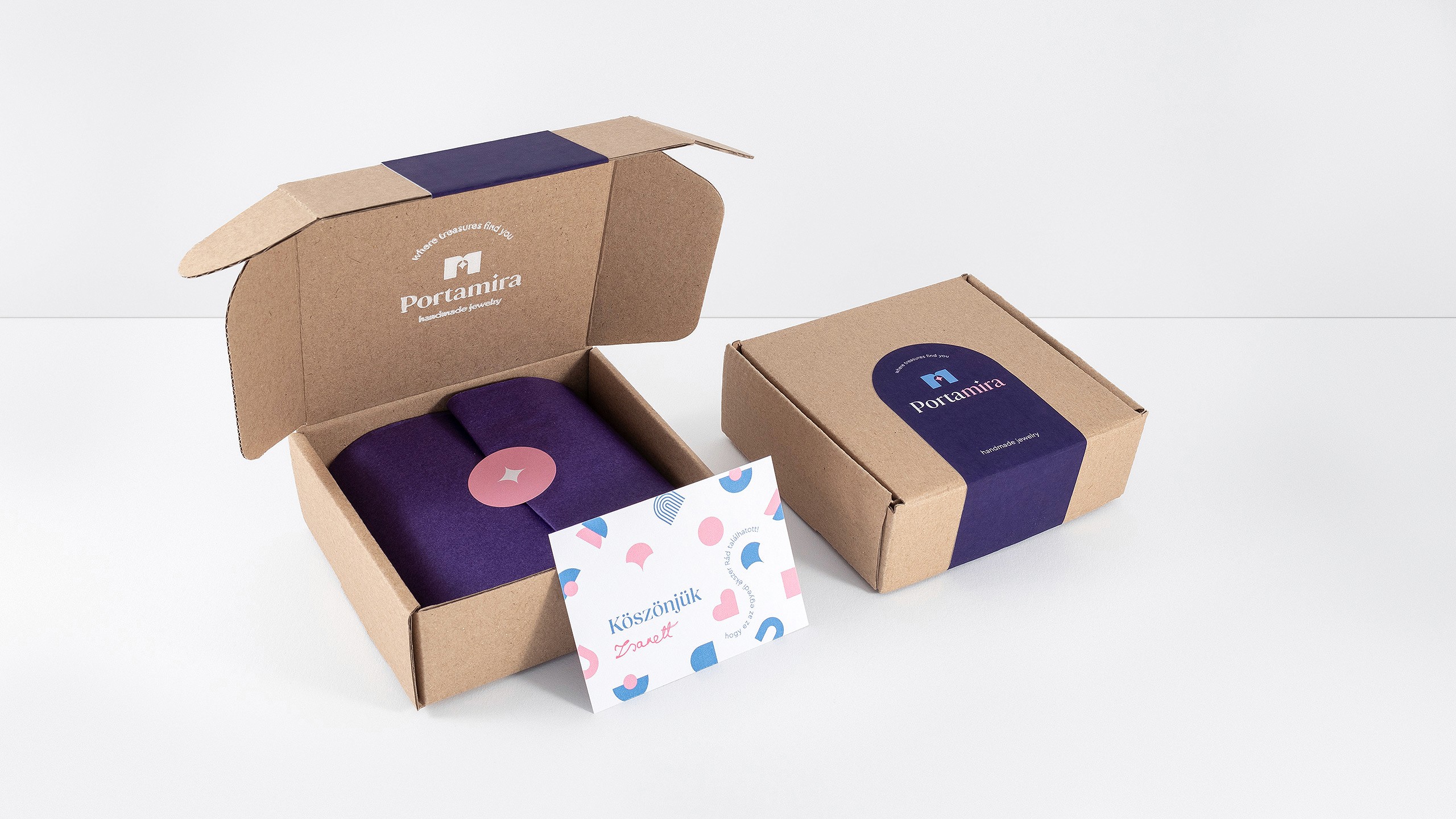
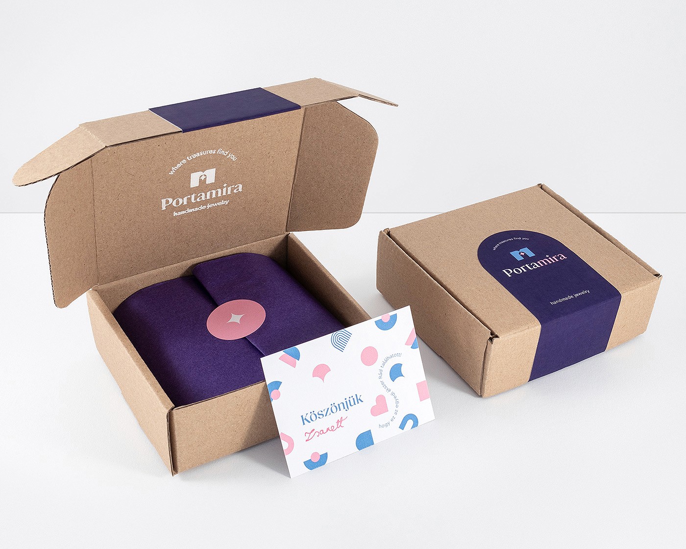
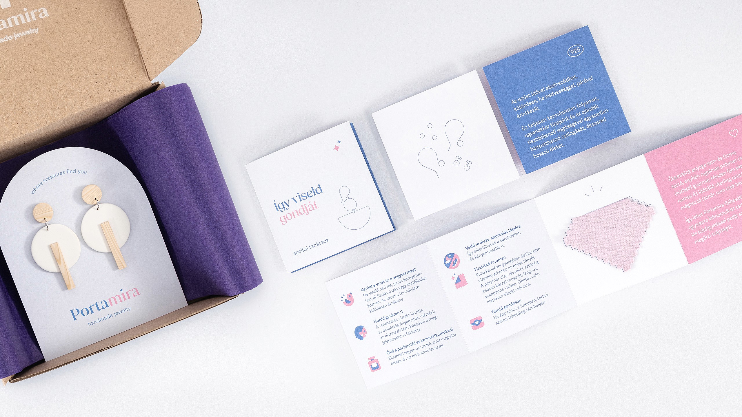
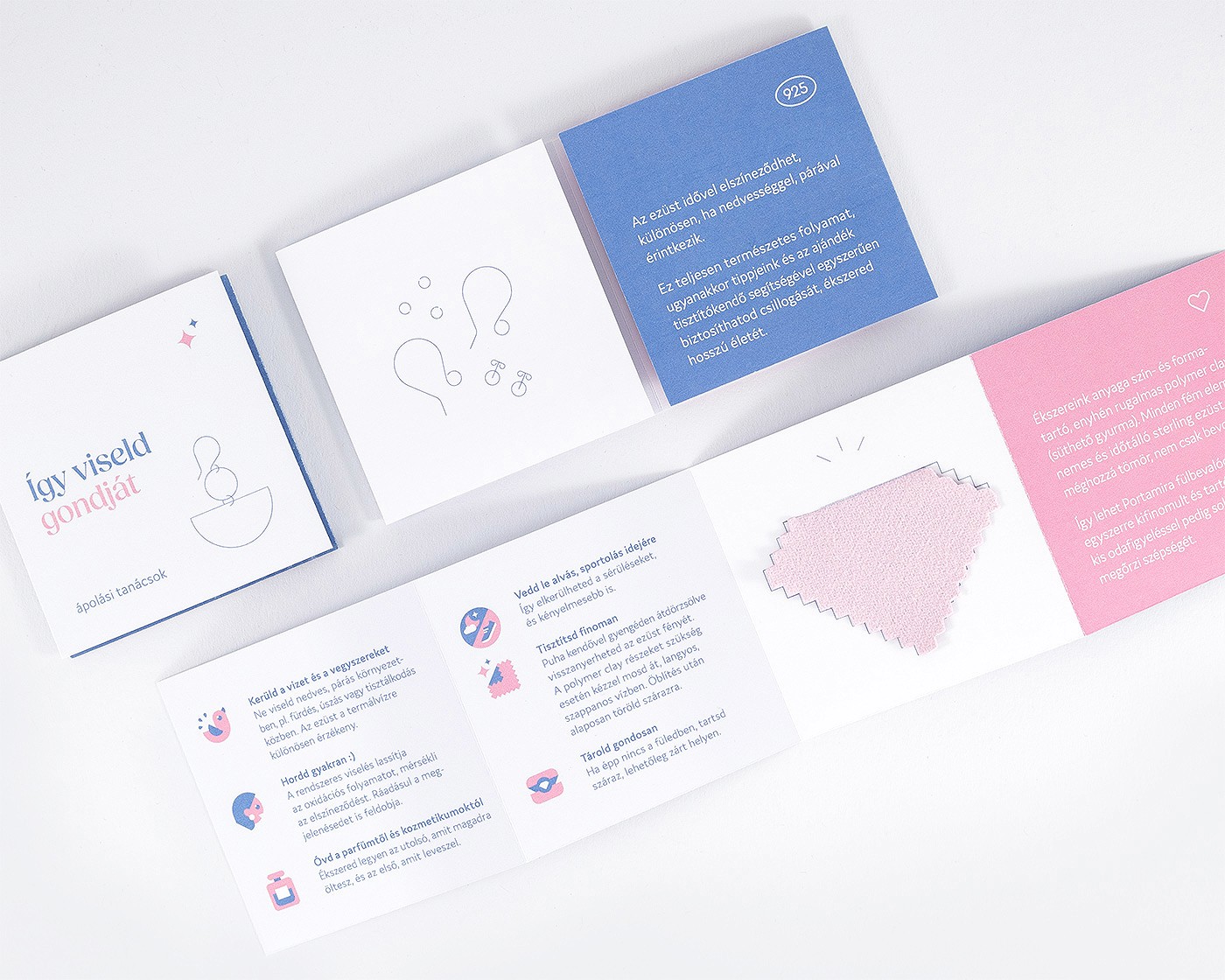
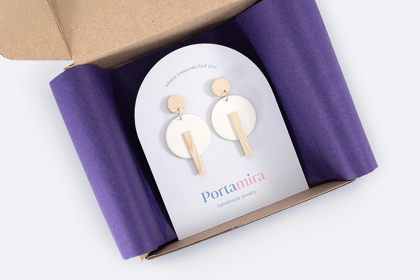
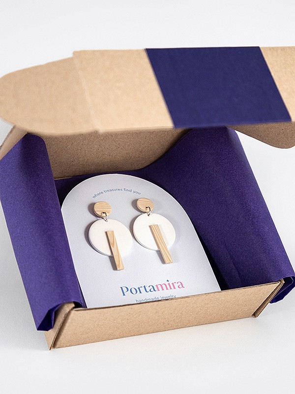
One of the main challenges was designing the packaging: developing a complete packaging concept for a given kraft cardboard box that could be produced at low cost, even with simple, at-home methods. Rather than working around this constraint, the solution builds on it – layered, carefully composed elements that turn the unboxing into a treasure chest experience.
Portamira is a small jewelry studio offering handcrafted, unique pieces sold exclusively online and available internationally. The goal was to create a distinctive visual identity that moves beyond the typical handmade aesthetic, elevating the perception of quality and precision to a more refined, professional level.
The concept is built around an elegant yet subtly playful brand world that invites exploration. Within this realm, each piece becomes a personal treasure, encouraging the wearer to express their unique personality. This idea is reflected in the geometric visual language, with the arch motif as a recurring element that frames and highlights the jewelry across applications.
The clean, structured foundation is softened by more lively colors, patterns, and icons, allowing the brand to feel both premium and approachable. The result is a cohesive, recognizable, and scalable visual system.
One of the main challenges was designing the packaging: developing a complete packaging concept for a given kraft cardboard box that could be produced at low cost, even with simple, at-home methods. Rather than working around this constraint, the solution builds on it – layered, carefully composed elements that turn the unboxing into a treasure chest experience.

Portamira on social media

Get in touch